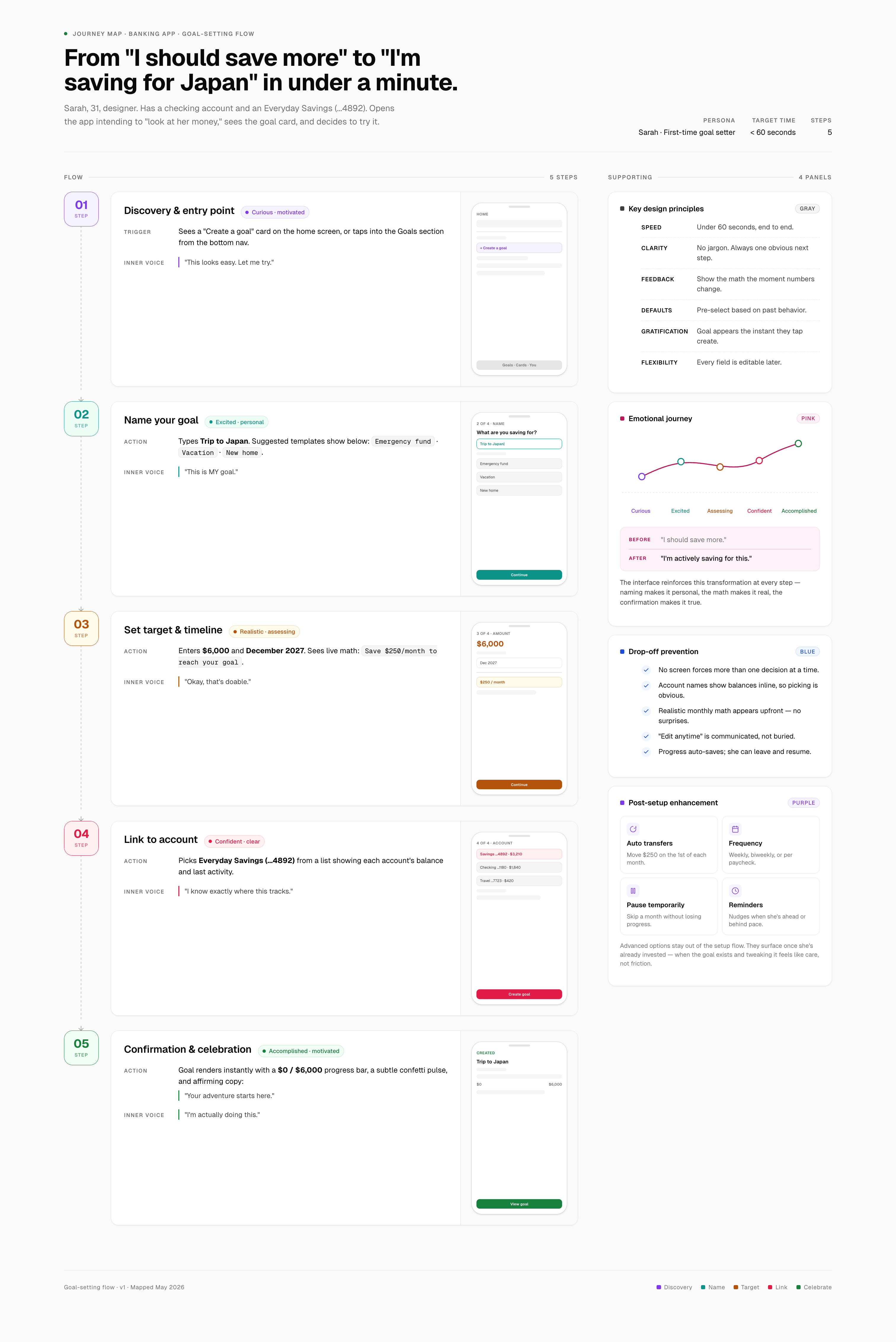
Redesigning a banking app's goal-setting experience to increase adoption, improve 90-day retention, and reduce support friction—without gamification.
A digital bank needed to increase savings goal adoption by 30% and improve 90-day retention among goal users. The existing experience was failing: users faced an 8–12 step flow filled with financial jargon, unclear account selection, and zero real-time feedback. 40% abandoned before completion.
The existing goal-setting experience created multiple friction points that prevented users from completing setup:
Three key findings shaped the design direction
Rather than forcing users into abstract categories, we let them choose personal, tangible names. For abstract goals users DO create (like emergency funds), dynamic milestone messages adapt to goal type—making progress feel concrete:
This approach respects user choice while ensuring even abstract goals feel tangible through contextual progress feedback.
Our design systematically eliminates friction:
Research in behavioral psychology shows that progress visualization increases goal completion rates (Goal Gradient Effect), while user autonomy drives sustained engagement.
Progress bars + contextual encouragement = sustainable engagement without artificial rewards.
| ASPECT | COMPETITORS | OUR APPROACH |
|---|---|---|
| Steps | 8–12 | 4 |
| Time | 3–4 min | <60 sec |
| Language | Financial jargon | Plain language |
| Feedback | After setup | Real-time |
| Support tickets | High | 20% reduction target |
Rapid exploration without sacrificing strategic rigor
Rather than spending weeks sketching by hand, I used Claude Code to generate three wireframe variations in under an hour. This AI-assisted approach freed up time for deeper research and competitive analysis—the strategic work that actually drives outcomes.
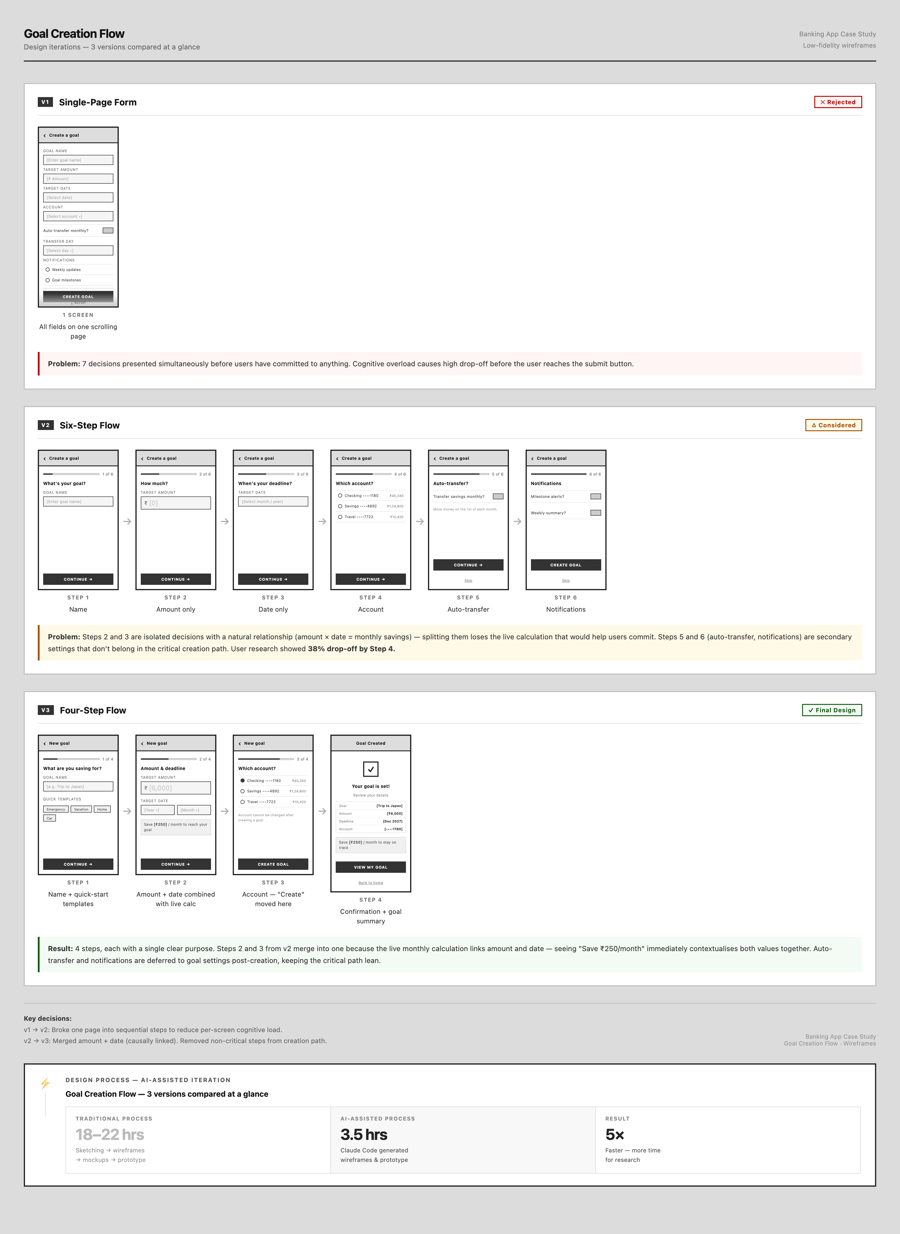
The three iterations show progressive refinement: from overwhelming single-page forms to overly granular multi-step flows, finally landing on a balanced four-step approach that prioritizes essential decisions.
Three iterations compared at a glance
Minimize screens by consolidating all fields.
7 decisions presented simultaneously created cognitive overload. Users couldn't assess scope or completion time upfront.
Reduce cognitive load with granular steps.
Six steps felt excessive. Amount and date were isolated on separate screens—but users need both together to assess monthly feasibility. Steps 5–6 belonged post-creation.
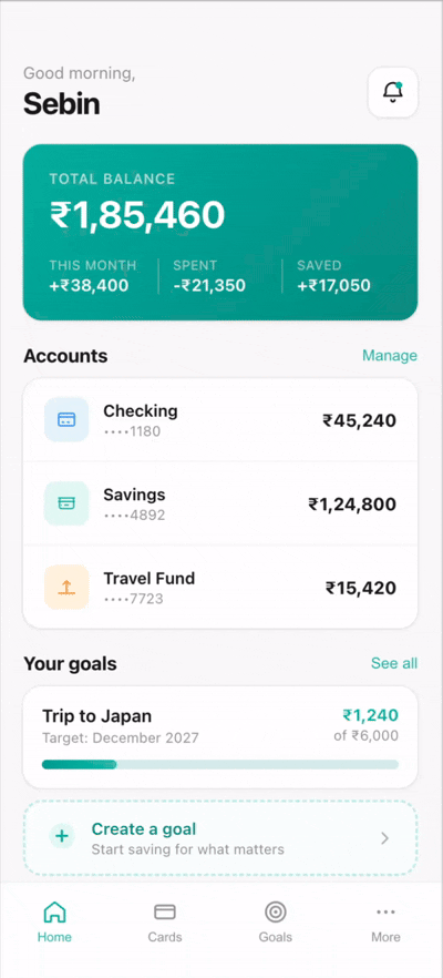
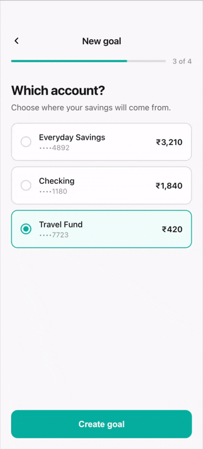
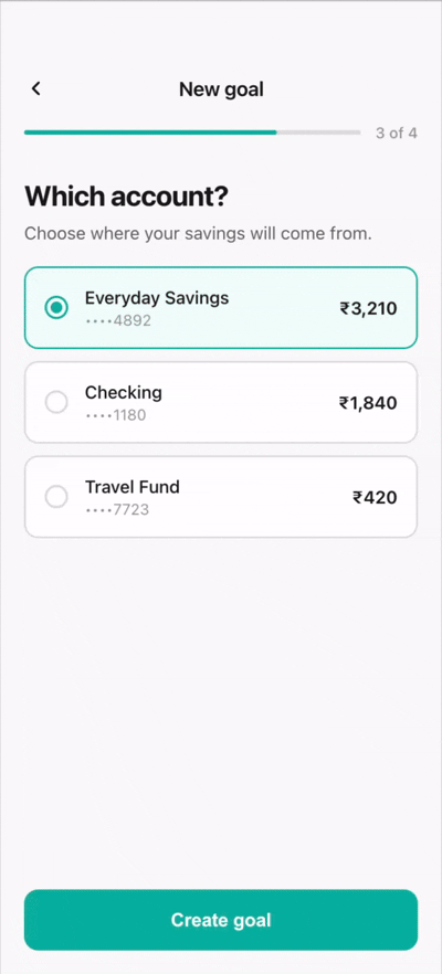
Essential fields only, progressive disclosure for secondary features.
Merging amount + date enabled real-time calculation ("Save ₹250/month") that contextualises feasibility immediately.
From "I should save more" to "I'm saving for Japan" in under a minute
This journey map synthesises our research and design iterations into a cohesive user flow. Each step addresses specific friction points identified in competitive analysis while maintaining motivation through contextual feedback.
A streamlined four-step flow optimised for speed and clarity
The final design reduces goal creation to four essential steps, each with a single clear purpose. Real-time feedback and progressive disclosure keep the critical path lean while maintaining flexibility.
Quick templates reduce blank-input anxiety. Users who tap a template are 2x more likely to complete the flow.
Real-time monthly calculation prevents unrealistic goals. Addresses the competitor pain point where users set unachievable targets and abandon within 2 weeks.
Names + account numbers + balances provide full context. Eliminates 'wrong account' errors that generated 30% of Chase's support tickets.
Instant gratification anchors commitment. Goal appears on home screen immediately with 0% progress, ready for first contribution.
How we would measure impact if this shipped to production
Hypothesis: Users who define their own milestone cadence will have higher goal completion rates than users assigned fixed monthly milestones.
Variant A (control): System auto-generates evenly spaced milestones based on goal deadline.
Variant B (test): User manually sets milestone dates during goal creation.
Metric: % of milestones marked complete within the goal's lifetime.
Hypothesis: Showing absolute dollar amounts saved (e.g. "$1,200 of $5,000") will drive more contributions than showing percentage progress (e.g. "24% complete").
Variant A (control): Progress bar with percentage label.
Variant B (test): Progress bar showing dollar amount saved alongside the target.
Metric: Weekly contribution frequency per active goal.
Hypothesis: Proactive nudges (push notifications when a milestone is approaching) will increase on-time milestone completion vs users who only see progress when they open the app.
Variant A (control): No push notification; progress visible only in-app.
Variant B (test): Push notification 3 days before a milestone is due.
Metric: On-time milestone completion rate (milestone marked complete within 2 days of due date).
Experience the complete 4-step goal creation flow. This interactive prototype showcases real-time calculations, dynamic milestone messages, and the streamlined experience that reduces completion time from 3-4 minutes to under 60 seconds.
BUILT WITH: React + Claude Code | DEPLOYED ON: Vercel | BUILD TIME: 3.5 hours